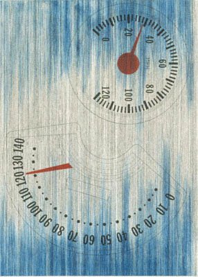
New Hoover convertibles, green, red, brown, new Hoover deluxe shampoo polishers yellow, brown doubledecker by Jeff Koons
That would be this sculpture and that Owada, but these are arty things. Covering the straight-up blowing and sucking for the last 3 days? That would be Verizon. Verizon is not arty. They just blow and and they just suck. No internet for me, and no posts for you. Chances are that there won't be any over the weekend either due to Verizon not sending somebody out to fix things until Monday. I'm piggy-backing on someone else's signal right now, but it won't last. So, that's the deal. See you on the other side.
And yes. I know. I'm mixing my art references, Creed and Koons. But wasn't it fun, and don't their names together sound like a funeral home?
Thursday, August 31, 2006
Monday, August 28, 2006
Song For The Season.
I've found my theme song for the new art season. It's going to be If Breast Implants Were Worth Scene Points, You'd Be a D-Cup by the UK grindcore band, The Magpyes. Grindcore doesn't get any . . . well . . . grindier than this, and song titles don't get any better. If I used a scoring system like the new one employed by TimeOutNY I'd give it 6 Stars. Then I'd kill myself for using a scale that was so cumbersome and idiotic.
Downtown.
Yes. I'm still posting about LA.
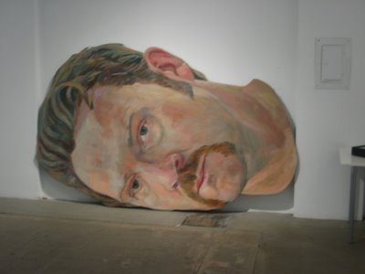
Wayne Coe
When I was visiting MOCA I walked over to see some of the Downtown galleries. It was interesting to see Wayne Coe's Pop Terrorism at Bert Green while having the TV ads for Oliver Stone's World Trade Center in my head. I don't care how good or true the movie might have been. He sold it with a reeking pop song. This one's for him and his ego. Speaking of which, it somehow seemed appropriate that I saw this the week after Mel Gibson's public display of self.
Wayne Coe
As an aside, if you were even remotely surprised by the behavior of said anti-semitic bore then you must have missed Hitch's deserved evisceration of Gibson's Christic hate-bomb when it came out.
Sebastian Lemm
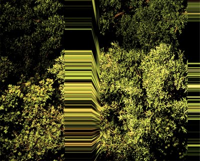
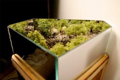
But I digress. A couple blocks away from Bert Green was a really strong group show, SPRAWL at BANK gallery. At first I thought these C-prints by Sebastian Lemm were paintings. When I realized what they were, it didn't matter. Lemm finds the ghost in the machine of the natural, and exposes and explodes it's interiors. Another artist exploring the space of nature (or maybe the nature of space) is Keith Lord. He works with small scale in a way that I haven't felt since Tara Donovan's legendary show at ACE Gallery in 2003. "Felt" is the key word there. I'm not sure how Lord or Donovan do it, but when they create that moment of belief in their scale it stays in your body, and it forces you to question all the moments and perceptions around it. Deal me in.
Keith Lord
Wayne Coe
When I was visiting MOCA I walked over to see some of the Downtown galleries. It was interesting to see Wayne Coe's Pop Terrorism at Bert Green while having the TV ads for Oliver Stone's World Trade Center in my head. I don't care how good or true the movie might have been. He sold it with a reeking pop song. This one's for him and his ego. Speaking of which, it somehow seemed appropriate that I saw this the week after Mel Gibson's public display of self.
Wayne Coe
As an aside, if you were even remotely surprised by the behavior of said anti-semitic bore then you must have missed Hitch's deserved evisceration of Gibson's Christic hate-bomb when it came out.
Sebastian Lemm
But I digress. A couple blocks away from Bert Green was a really strong group show, SPRAWL at BANK gallery. At first I thought these C-prints by Sebastian Lemm were paintings. When I realized what they were, it didn't matter. Lemm finds the ghost in the machine of the natural, and exposes and explodes it's interiors. Another artist exploring the space of nature (or maybe the nature of space) is Keith Lord. He works with small scale in a way that I haven't felt since Tara Donovan's legendary show at ACE Gallery in 2003. "Felt" is the key word there. I'm not sure how Lord or Donovan do it, but when they create that moment of belief in their scale it stays in your body, and it forces you to question all the moments and perceptions around it. Deal me in.
Keith Lord
Thursday, August 24, 2006
Los Angeles County Museum on Fire.
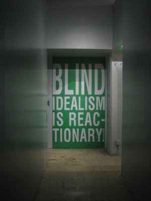
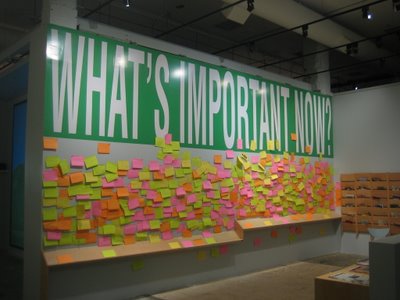
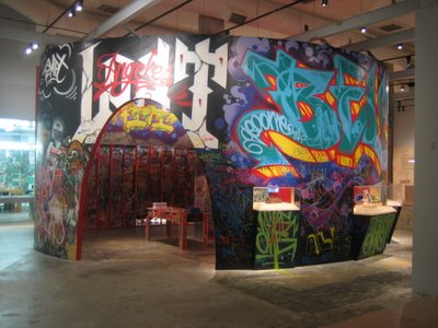
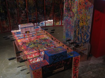
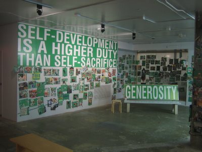
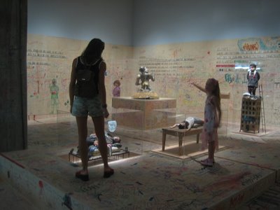
To be more specific, LACMALabs is on fire with Consider This . . ., an interactive exhibit designed by Barbara Kruger. It features the artists Mark Bradford, Dorit Cypis, Margaret Honda, Philip Rantzer, Mario Ybarra, Jr., and Bruce Yonemoto, and the work of anybody who comes to the show and wants to join in. Everybody (And I mean everybody. Very punk rock, that.) brings all their hopes and fears through the doors, and if they so choose they can add them to the exhibit. Kruger's text frames the exhibit, while the specific installations dig into and inspire it's audience in a more surgical way.
The title Consider This . . . works as both an open invitation and as a taunt. As in, consider this . . . motherfuckers. Like, wouldn't it be mad if we opened up our tunnel jet vision? In our stupid times it was moving--no, it was stunning-- to be in a place where considering anything at all was encouraged. Thinking was OK. Hopefully this crazy idea will spread. But I'm not holding my breath. I must not think bad thoughts.
Tuesday, August 22, 2006
I Will Follow.
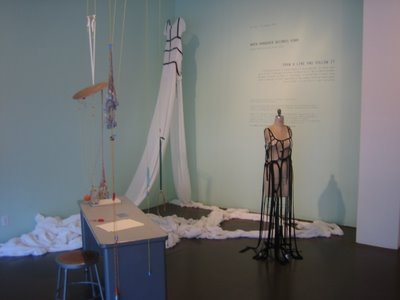
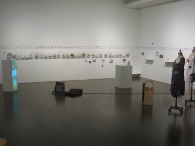
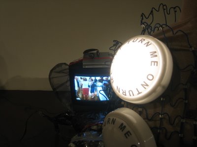
One of the liveliest shows I saw in LA was Draw a Line and Follow It at LACE in Hollywood. I knew I was in for a treat when I walked in the door and heard the sounds of Steve Roden's sound installation. That guy never gets it wrong. And I mean, like, never. Plus there was A Dress that Never Ends by the LA Art Girls. There's nothing better than encountering an old fave (Roden) and finding a new one (LAAG) in the same instant. Have I mentioned what a good time I had in LA?
Yoko Ono
The show uses Fluxus methods, instructions, and objects as it's inspiration. It's a testament to the strength of the Fluxus movement and to the artists involved here that the show works so well. The truth is, shows in a similar spirit are usually tedious. It might be a freeing experience for the artists involved in these things. The rest of us? Trust me, we're bored out of our minds. But as I was saying, the LACE exhibit is far away from anything that even resembles the typical derailment.
Result Formed Before
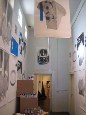
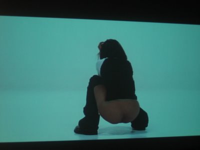
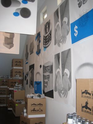
I pretty much liked everything in Draw a Line and Follow It, but of course there were standouts. One of those pieces was a collaboration of four artists, Result Formed Before. Their installation felt like a little manageable world in the back of LACE. All those productless products. All those displays. I found it comforting and familiar, and that was worrisome. It forced me to think about what easy marks we humans are when it comes to product design and placement. It felt like a little magical forest with something dark behind every tree.
Alexandra Grant
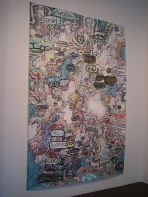
Alexandra Grant's painting in the front room was a lot less emotionally complicated for me. I just liked to stand in front of it and looking at it's beautiful messiness. It doesn't get any simpler than that.
I followed the open, wild line they drew at LACE. I hope that some of you had a chance to do the same, as Sunday was the last day of the exhibit. I guess all good lines have to eventually find the edge of the paper, but this line was so good that it continues to move inside me, drawing me in, fleshing itself out. Have I mentioned what a good time I had in LA?
Thursday, August 17, 2006
LA Revelations.
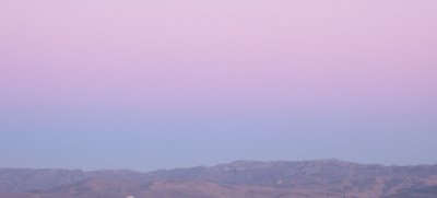
1. I appreciate Ed Ruscha's paintings in a new way now. This is what I saw driving through the valley every night after sunset, and it always reminded me of Ruscha's backgrounds slowly burning from one color to another.
The Back of Hollywood (billboard)
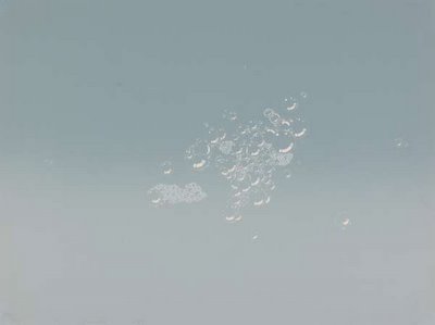
Suds Grey
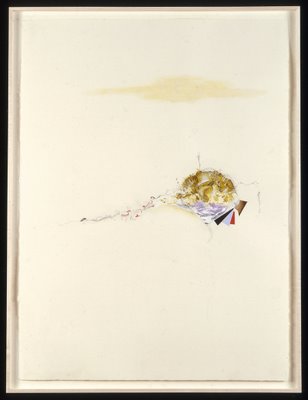
2. Luke Whitlatch. WTF? Where did this guy come from, and why doesn't he have a gallery? He should have one in Los Angeles and New York. Somebody needs to get on that. His drawing, The Key to a Cigarette is a Man Named Narch, stopped me in my tracks at a fairly amazing show of drawings at Daniel Weinberg Gallery at 6150 Wilshire. There were fine works by everyone from Ed Ruscha and Lee Bonteceau to Daniel Zeller and Hilary Harkness, but there was something about the daring in this Whitlatch piece that I loved. The mix of exquisite details, space, and a few minimalist touches create a sweet tension that somehow fills the frame. "Tension" isn't quite the word though. This drawing is more like an engine than anything: friction producing movement and awe.
3. Rosanna Bruno should have a show in Los Angeles. It's just a hunch, but I'm pretty sure that it would be all perfect-like if she did. She is very much a New York artist, but there's something about the light in LA that would work well with her paintings.
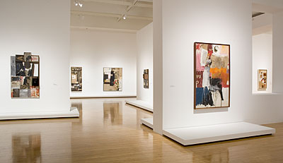
4. The Rauschenberg Combine show at MOCA. I saw this show at The Met and was appropriately knocked out, but--if you can even begin to imagine--it's even stronger at MOCA. Working with less floorspace than the Met, the installation augments the show in a way it didn't at the Met. There are a few magical vantage points where you can look through the exhibit and see the combines overlapping across space and time.
5. Why do young artists even bother to live in New York anymore? What a waste of their time, money, and power. Go West, young men and young women. Go West.
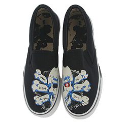
6. Z-Boy sneakers and gear. Totally rad and filled with the spirit of Dogtown. Not an easy thing to translate, but they've done it.
7. I love LA. I mean, I reallyreallyreally love LA.
The Back of Hollywood (billboard)
Suds Grey
2. Luke Whitlatch. WTF? Where did this guy come from, and why doesn't he have a gallery? He should have one in Los Angeles and New York. Somebody needs to get on that. His drawing, The Key to a Cigarette is a Man Named Narch, stopped me in my tracks at a fairly amazing show of drawings at Daniel Weinberg Gallery at 6150 Wilshire. There were fine works by everyone from Ed Ruscha and Lee Bonteceau to Daniel Zeller and Hilary Harkness, but there was something about the daring in this Whitlatch piece that I loved. The mix of exquisite details, space, and a few minimalist touches create a sweet tension that somehow fills the frame. "Tension" isn't quite the word though. This drawing is more like an engine than anything: friction producing movement and awe.
3. Rosanna Bruno should have a show in Los Angeles. It's just a hunch, but I'm pretty sure that it would be all perfect-like if she did. She is very much a New York artist, but there's something about the light in LA that would work well with her paintings.
4. The Rauschenberg Combine show at MOCA. I saw this show at The Met and was appropriately knocked out, but--if you can even begin to imagine--it's even stronger at MOCA. Working with less floorspace than the Met, the installation augments the show in a way it didn't at the Met. There are a few magical vantage points where you can look through the exhibit and see the combines overlapping across space and time.
5. Why do young artists even bother to live in New York anymore? What a waste of their time, money, and power. Go West, young men and young women. Go West.
6. Z-Boy sneakers and gear. Totally rad and filled with the spirit of Dogtown. Not an easy thing to translate, but they've done it.
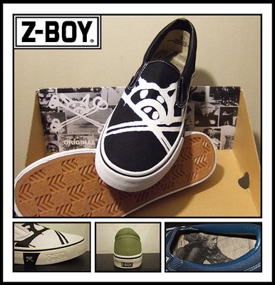
7. I love LA. I mean, I reallyreallyreally love LA.
Thursday, August 10, 2006
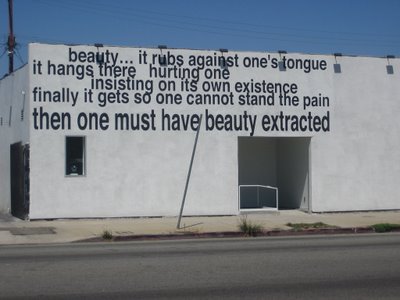
It Rubs Against One's Tongue.
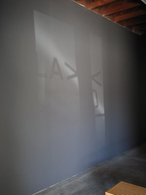
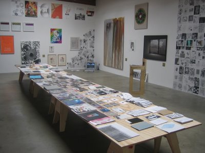
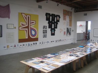
OK. LA is kickin' my ass in the best of ways. Here are some of the pics.
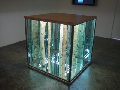
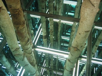
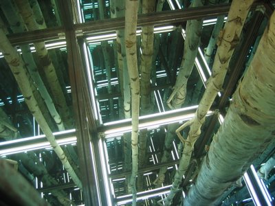
My favorite piece of the day was one of the first: Anthony James' sublime Birch 4 X 4 X 4 in The Monty Hall Problem at Blum & Poe in Culver City.
LAX Art
Outside
Inside
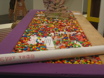
Bring the War Home at QED. Probably my favorite show of the day.
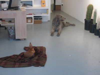
Martin Creed's Big Dog at MC. And yes. These are real dogs. They are there during gallery hours.
Last and very much NOT least . . . LACE in Hollywood. Over cocktails with director Carol Stakenas I realized that, Los Angeles, you are a very lucky city to have both LACE and Carol. She's got plans for you, and they're all good. They're all very, very good.
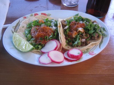
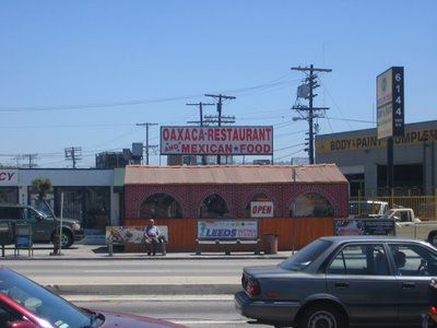
And let's not forget my lunch at Oaxaca on Venice just off of La Ceniega. Thank you, Genevieve!
Monday, August 07, 2006
HAA in LA.
Ed Ruscha: Clown Speedo, 1998, Aquatint, Published By Pace Editions, Inc, Edition of 35
I'm going to LA this week for a wedding and a little art gazing so there probably won't be any posting going on. Big ups to Caryn at art.blogging.la, Chris at The OC Artblog, Bert Green, and Sarah Cohen and Carol Stanekas at LACE for guidance and general kindness.
In the meantime, I just put up two new posts up on the Creative Time blog.
Official HAA LA Playlist:
Pink Spiders - Teenage Grafitti*
Uriah Heep - Sweet Freedom
Leroy Brown - Color Barrier
Agoraphobic Nosebleed - Frozen Corpse Stuffed With Dope
King Crimson - Starless and Bible Black
Suicide - American Supreme
Digital Mystikz mixes
Ted Nugent - Free-For-All
Dry & Heavy - One Punch
Wasteland - All Versus All
Roxy Music - Siren
I-F - Fucking Consumer
Burning Star Core - 'let's Play Wild Like Wildcats Do'
Burnt Sugar - Black Sex Y'all Liberation & Bloody Random Violets
Nantucket - Your Face or Mine
Todd Rundgren - A Wizard, A True Star
*Just go buy this Pink Spiders record. It'll only cost you 10 bucks, and it's like The Cars and Cheap Trick beating the crap out of The Strokes (Poseurs!) in an alley. Sheer pop genius.
Saturday, August 05, 2006
Cube Your Enthusiasm.
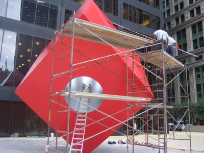
I've always been somewhat ambivalent about the Isamu Noguchi sculpture, Red Cube, at 140 Broadway around the corner from work. However, it was pretty thrilling to see them freshening it up yesterday when I went out for lunch. Luckily, I had my camera with me. Looking through the lens made me pay closer attention to the angles it lives with everyday. Fresh paint. Open heart.
np: Merzbow: Music For Bondage Performance 2
Subscribe to:
Posts (Atom)